
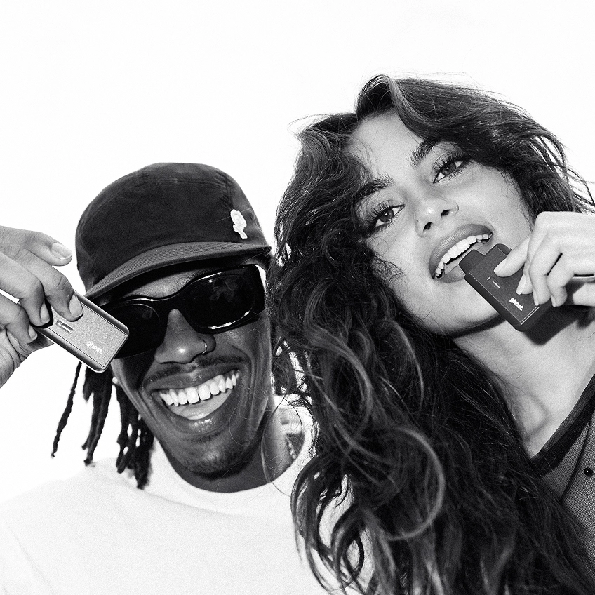
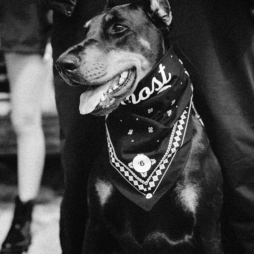
Ghost needed a visual system that matched the sophistication of its product — clearer, sharper, more aligned with the brand's ambition. The monochrome palette stayed; structure, texture, and breathing room did the elevating. Photography moved from product shots to lifestyle imagery with depth.
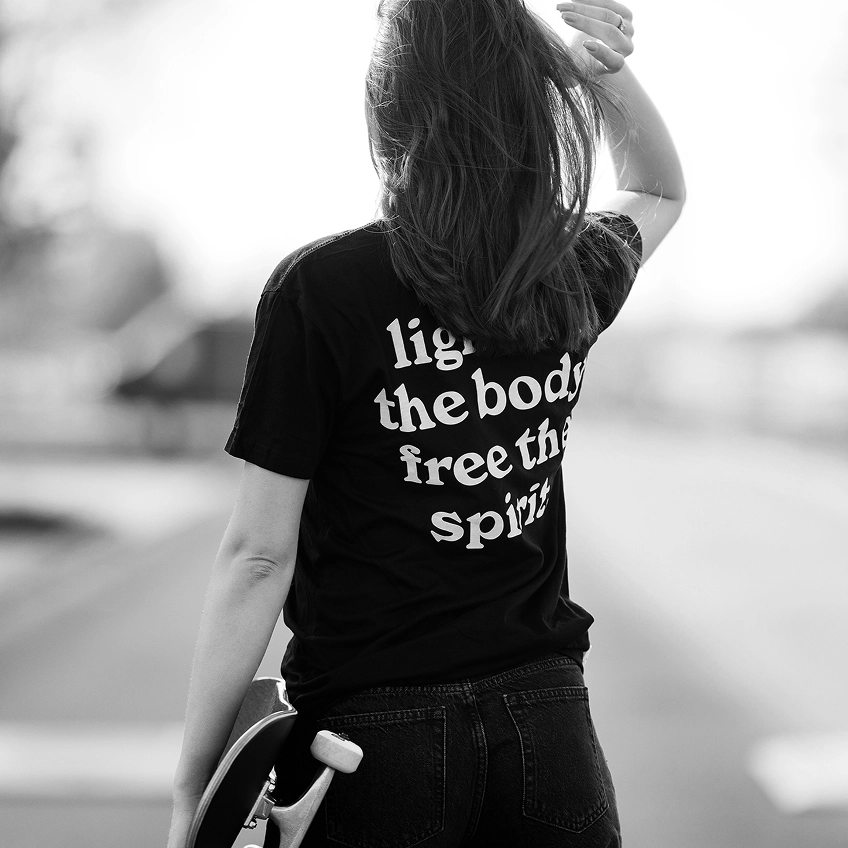
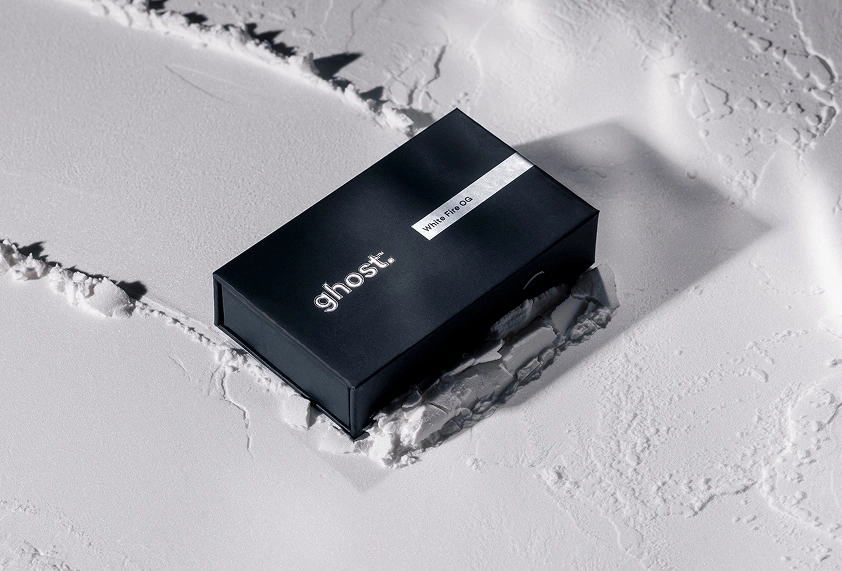
Ghost needed a visual system that matched the sophistication of its product—clearer, sharper, and more aligned with the brand’s ambition. We brought definition and restraint to a space often ruled by visual noise.
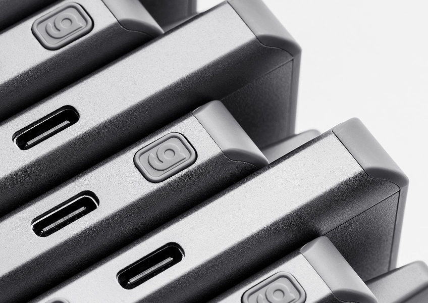
We applied structure where it mattered most. TT Commons remained the core typeface, but its role was redefined. Headlines now lead with confidence, while dosage and product details are clearly ordered without competing for attention.
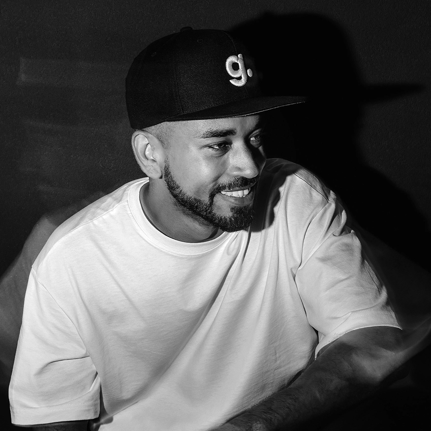
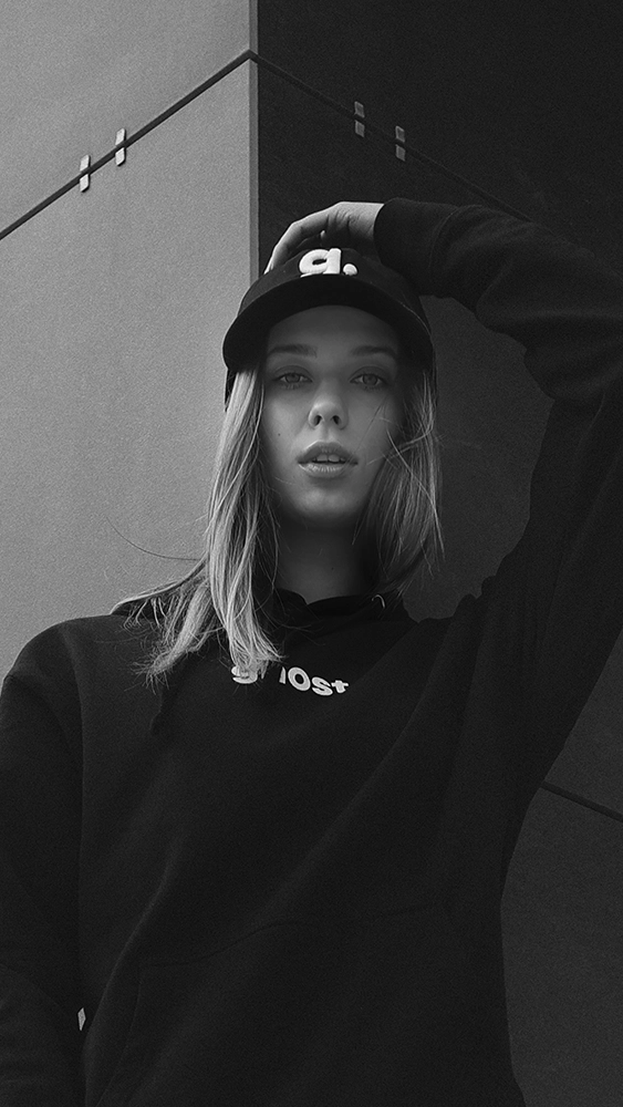
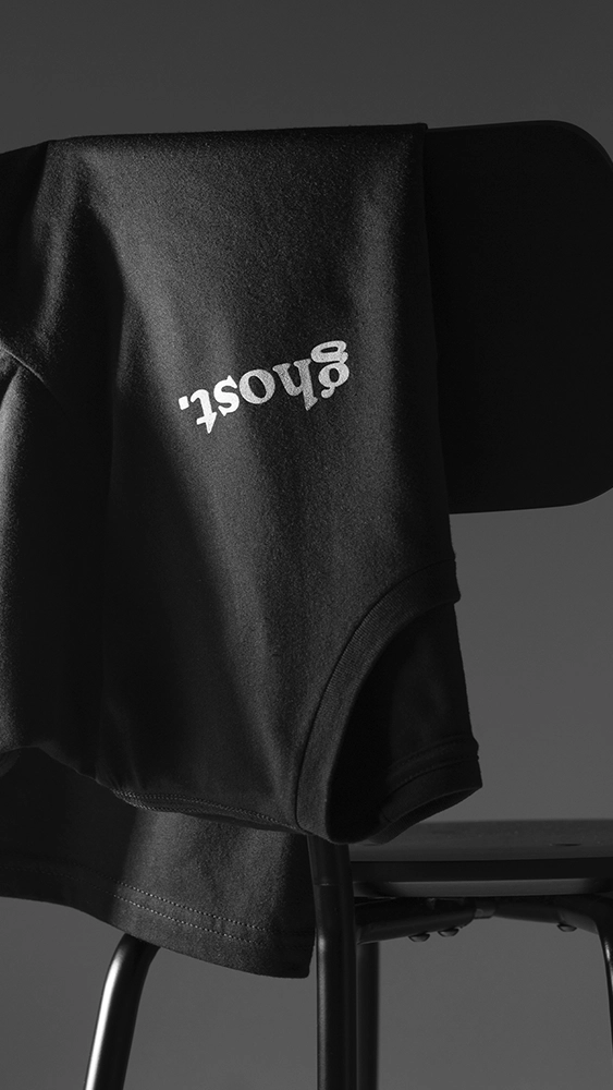
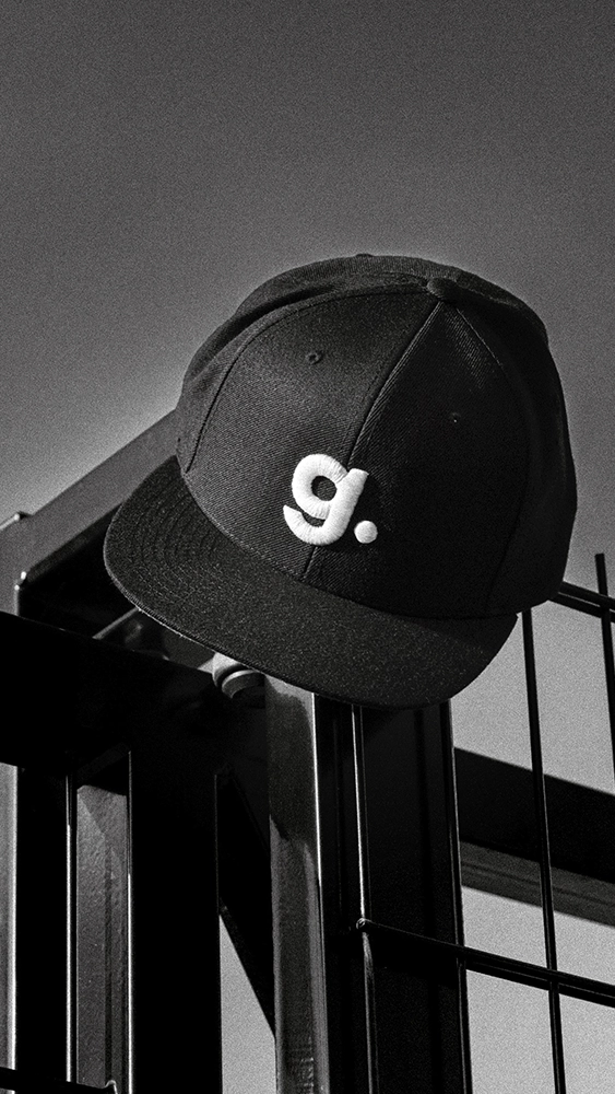
Ghost describes its brand as "luxury meets chaos." We used that tension as design direction. The monochrome palette stayed, but new texture, contrast, and spacing gave the system room to breathe.
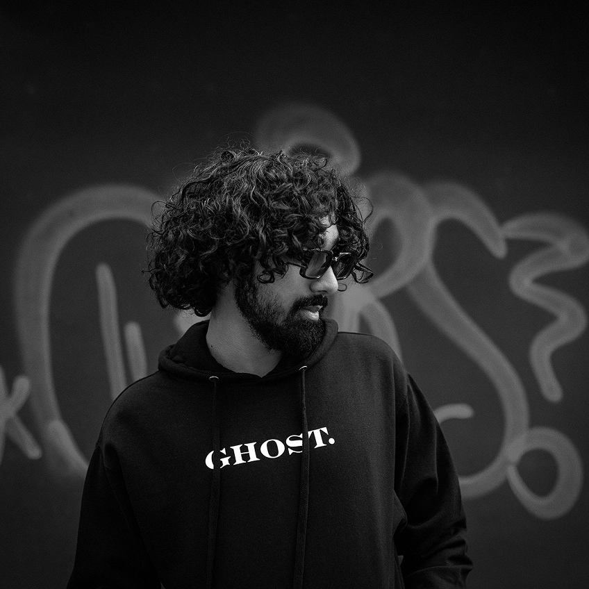
Photography moved from product shots to visual systems with presence. Still monochromatic, but with more depth, texture, and control. Natural elements were introduced to soften the tech edge, creating imagery that supports the lifestyle without overstating it.
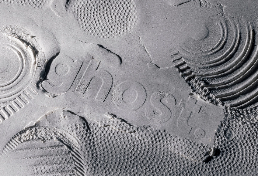
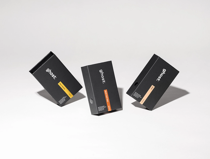
Imagery courtesy of Karolina L., Melanie G., Jace C., Riches & Saint
Book a short scoping call and we'll map your priorities to the right engagement.