
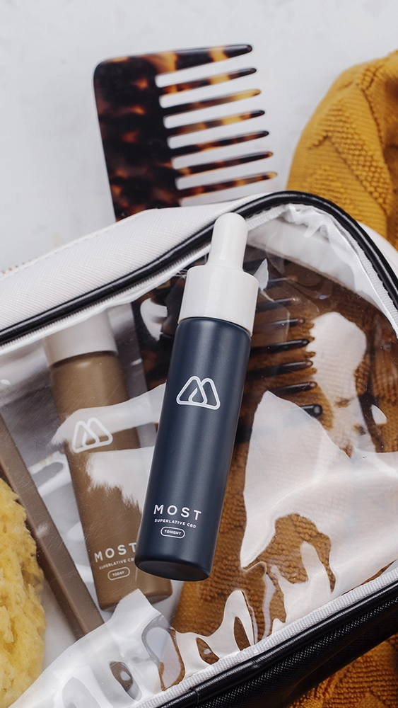
Most set out to be the CBD brand you display, not the one you tuck out of sight. The experience is built on restraint: a geometric mark of mountain peaks and golden drops, deep navy instead of wellness-aisle green, and color-guided tiers that make choosing a product feel effortless.
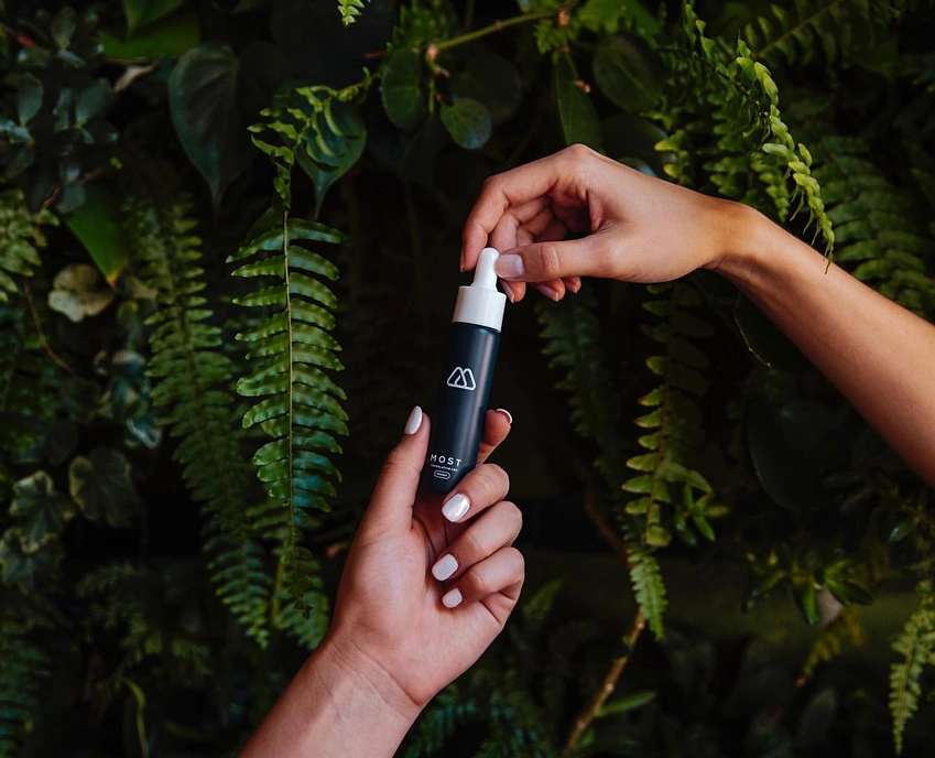
In a wellness category crowded by hypercolor gradients and sterile white minimalism, MOST stands apart by staying composed. Its visual identity doesn't chase attention—it earns it through clarity, balance, and restraint.
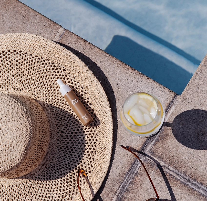
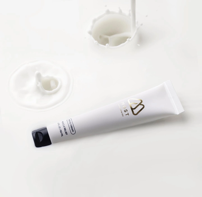

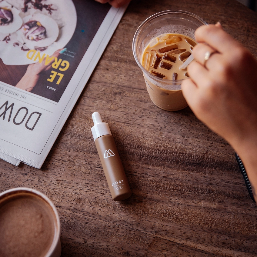
The founders set out to create a CBD line that felt elevated and intelligent—products that could live proudly on your bathroom shelf, not tucked away out of sight.
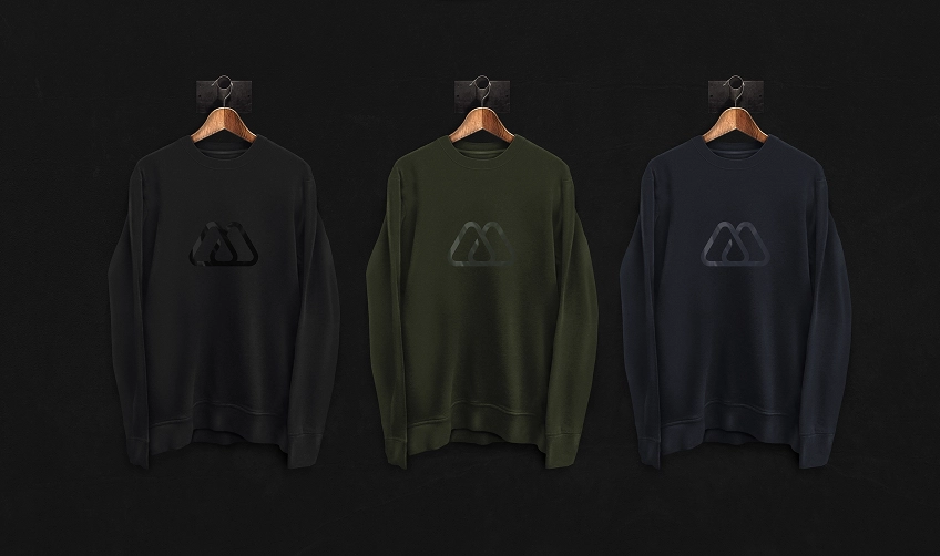
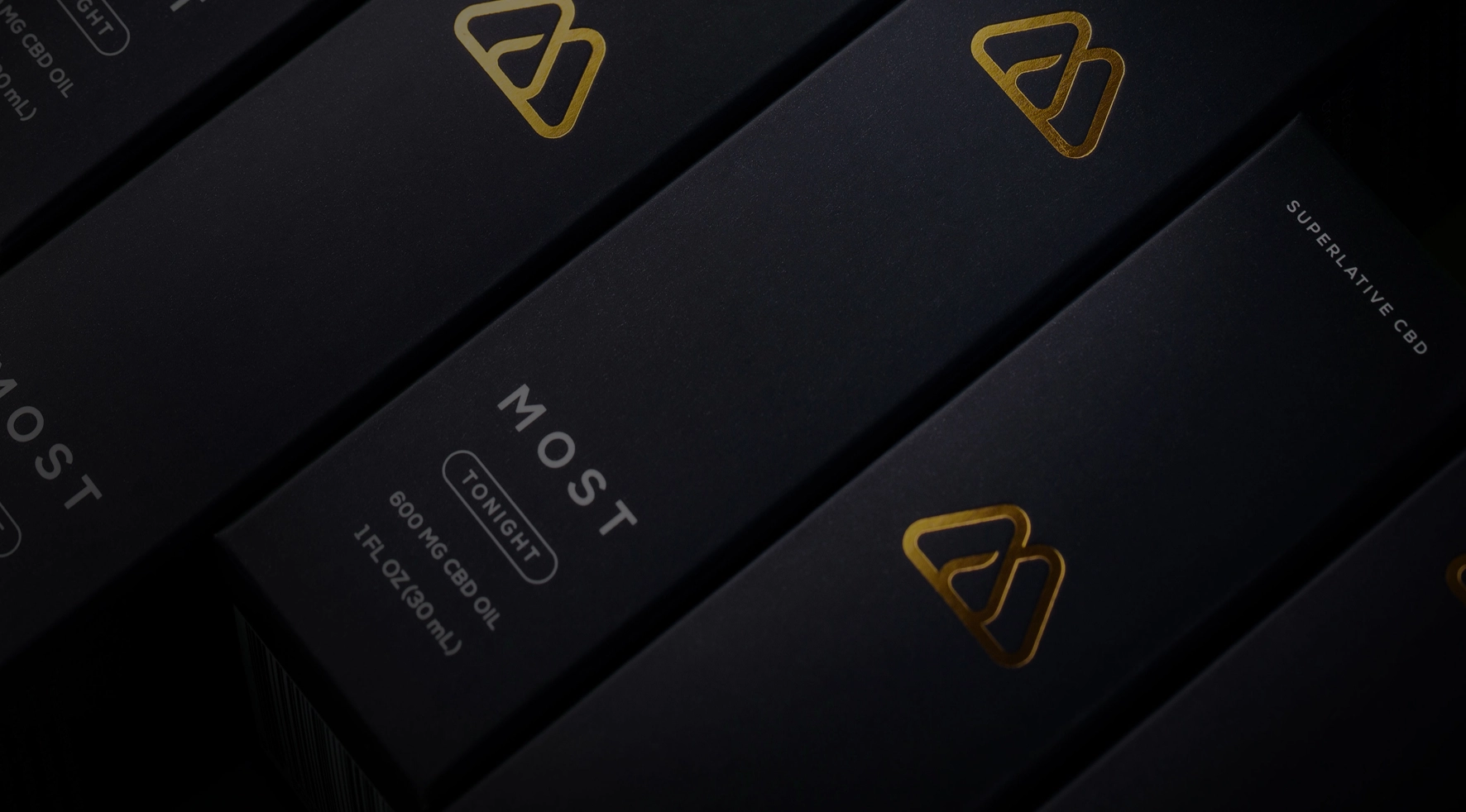
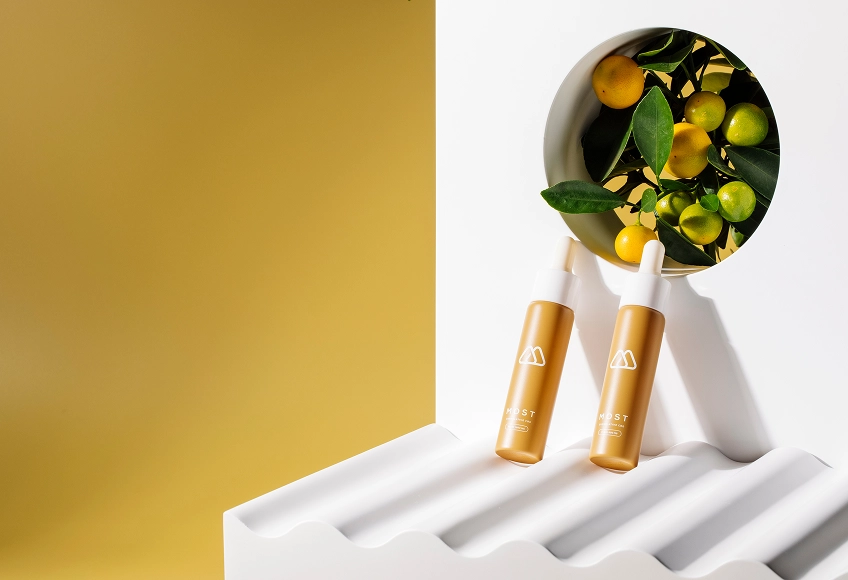
The brand system delivers exactly that. The identity blends minimal form with subtle symbolism. A geometric mark references mountain peaks and a golden drop—layered meaning, executed with control. It's confident, not loud.
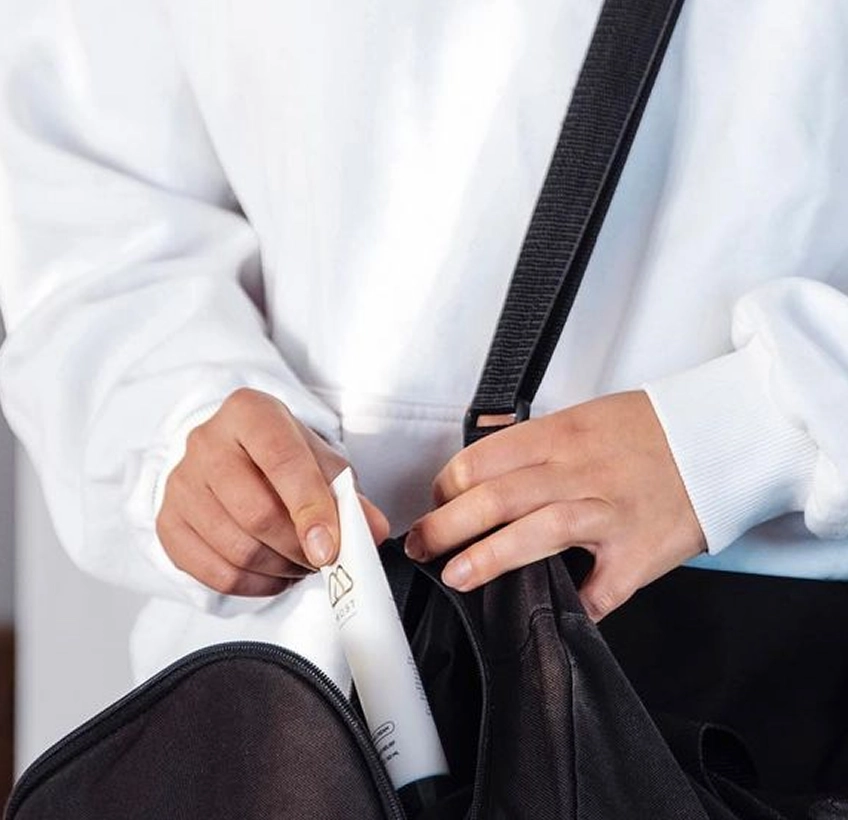
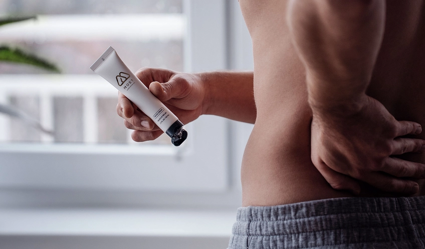
We avoided expected greens in favor of a palette with more presence. Deep navy grounds the brand, while gold and soft orange define product tiers without compromising tone. It reads as premium at a glance—and holds up under scrutiny.
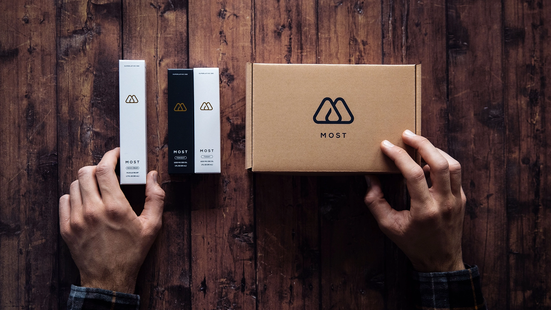

Typography is clean and composed. Headlines speak with authority, while secondary elements maintain clarity without crowding. Every layout respects hierarchy. Nothing is overworked.
MOST proves that restraint can make a statement. No clichés. No overbranding. Just a system that reflects the integrity of what's inside.
Imagery courtesy of Karolina L.
Book a short scoping call and we'll map your priorities to the right engagement.