
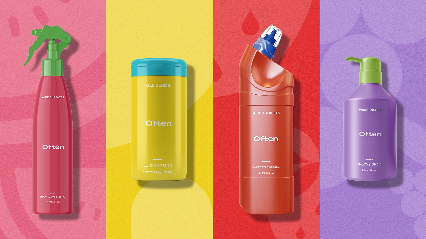
The cleaning aisle is crowded with sterile whites, tired blues, and faux-eco beige. Often turns a chore into a small daily pleasure: bright, expressive color that balances joy and order, structured type with softer details — clean, never clinical.
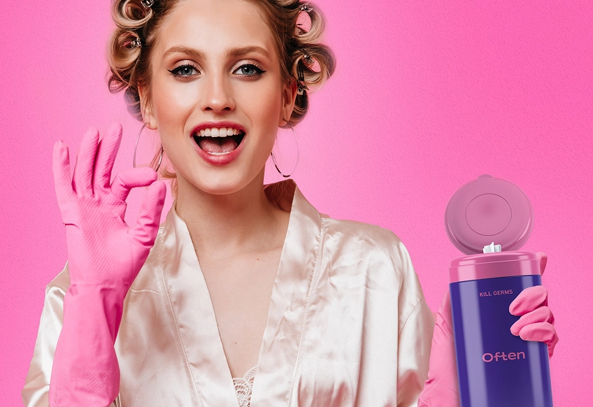
The cleaning aisle is crowded with sterile whites, tired blues, and faux-eco beige. Often breaks that pattern with design that actually makes you want to pick up the bottle—and leave it out when you're done.
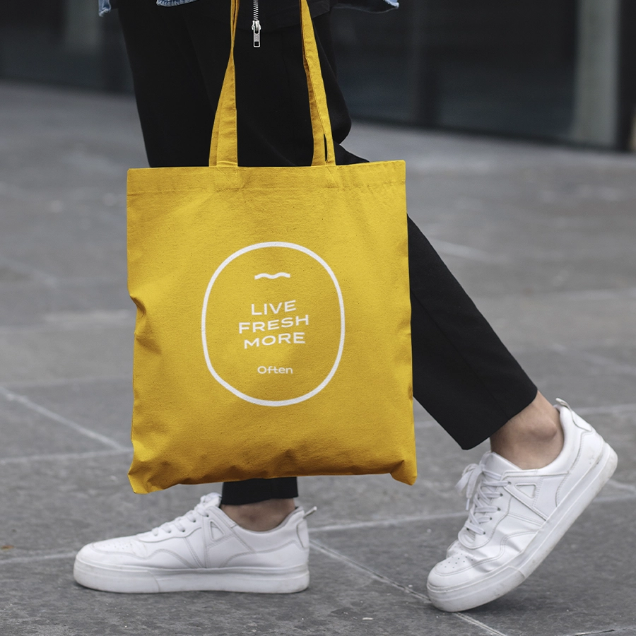
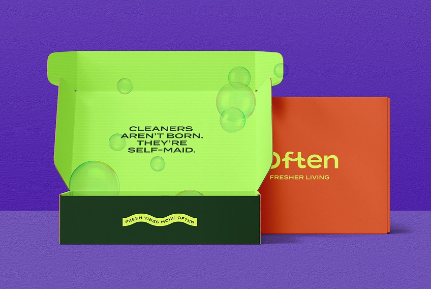
We developed a brand that feels as fresh as the surfaces it touches. Bright, expressive color choices add energy without leaning juvenile. The identity balances joy and order—shelf presence that holds its own and still feels at home on your counter.
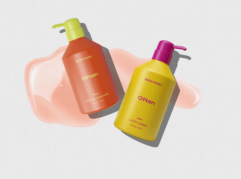
Typography plays a strategic role in Often's tone. Structured, bold type gives the brand its voice, while softer details keep it approachable. It reads clean, not clinical. Clear, not cold.
The final system doesn't try to mimic skincare or overstate eco-credentials. It simply looks better—because it's designed better. In a category where aesthetics are an afterthought, Often leads with intent.
Book a short scoping call and we'll map your priorities to the right engagement.