
P's was built from nothing: name, product architecture, messaging, and a full visual system. Scientific credibility meets understated humor — hero colors per product on a neutral foundation called C.R.E.A.M., built to scale on a retail shelf.
P's strikes a sharp balance—simple design paired with a confident voice. It's a hemp brand that doesn't overreach, yet leaves a mark. We built the brand from the ground up: name, product lines, copy, and visual identity. Every customer-facing detail was shaped to hold together with clarity and consistency.
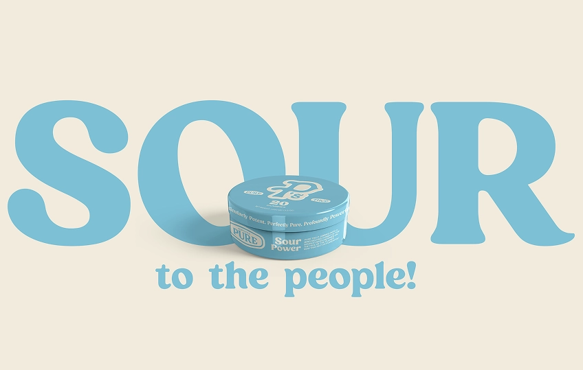
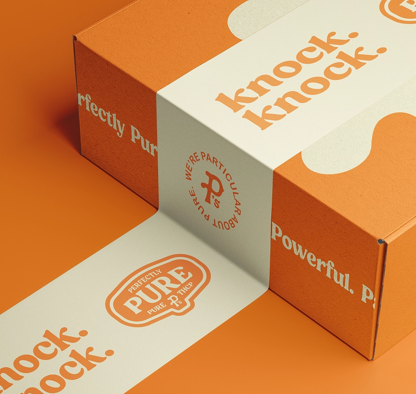
Color strategy follows the same logic. Each product owns a hero color, paired with the brand's neutral base: C.R.E.A.M. The result is a scalable visual system that reads clearly on shelf without feeling repetitive.
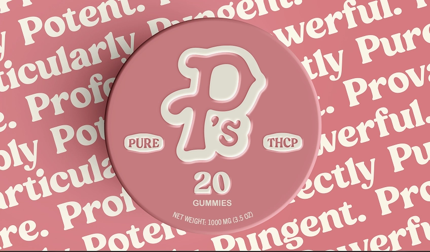
Typography is deliberate. Arial Rounded MT Bold handles product data. Rolla carries the headlines. It's a blend of clean science and laid-back tone, direct, but never clinical.
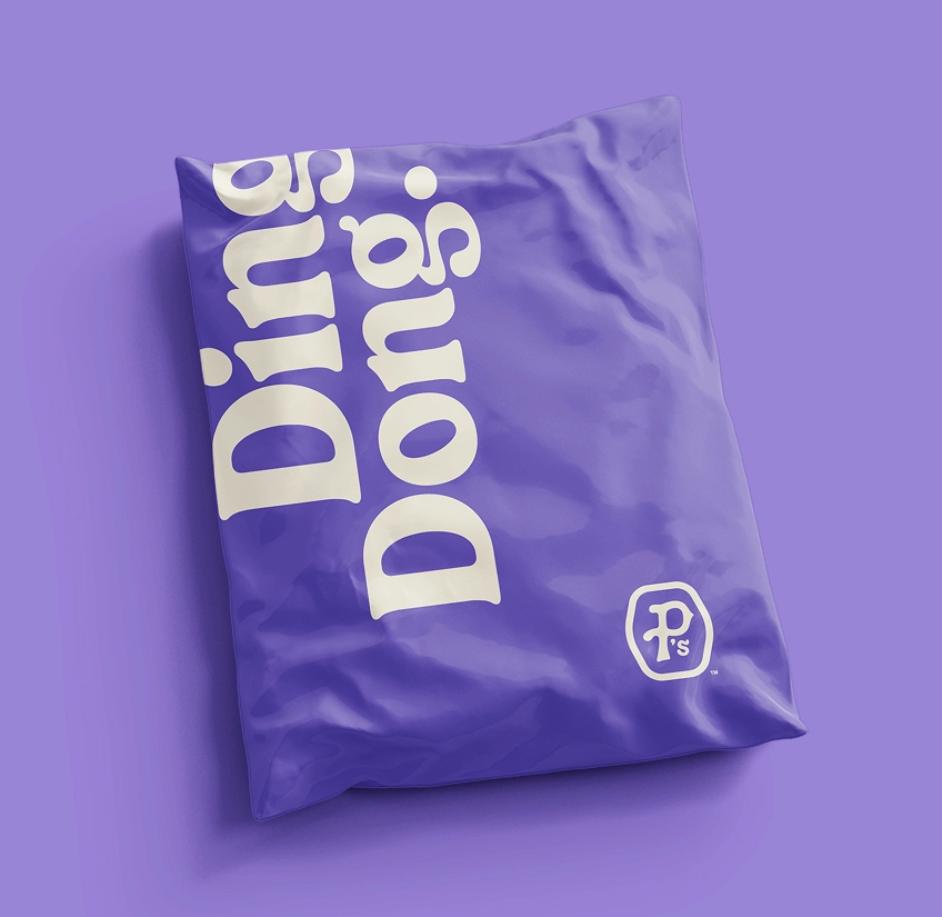
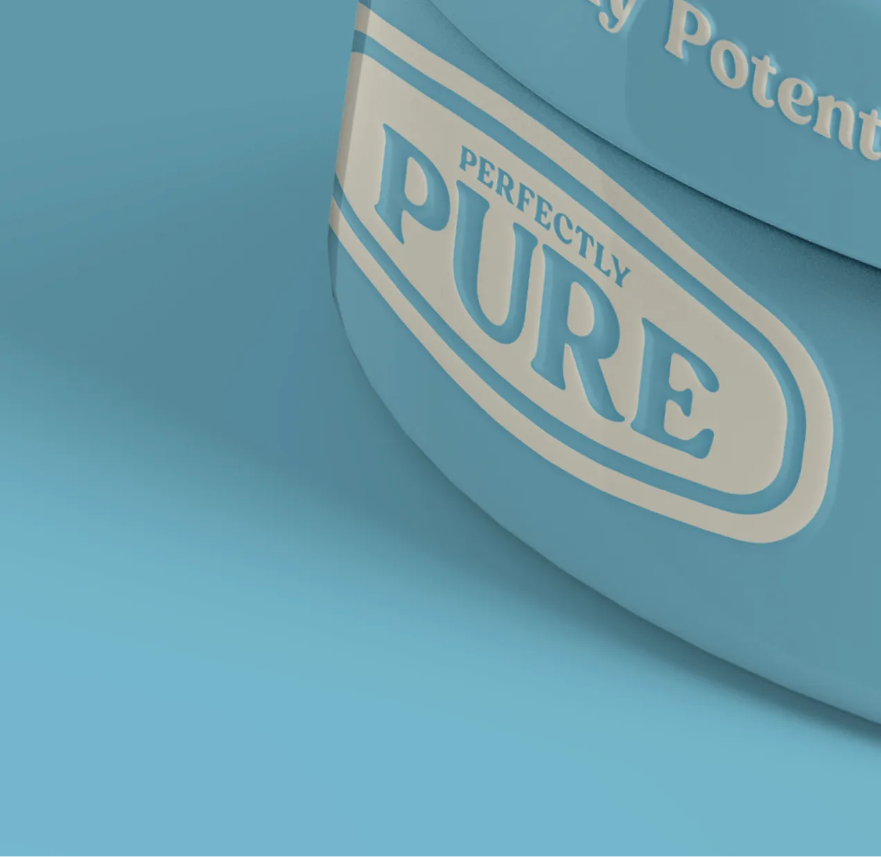
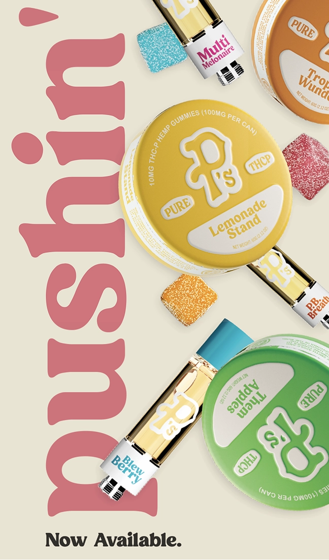
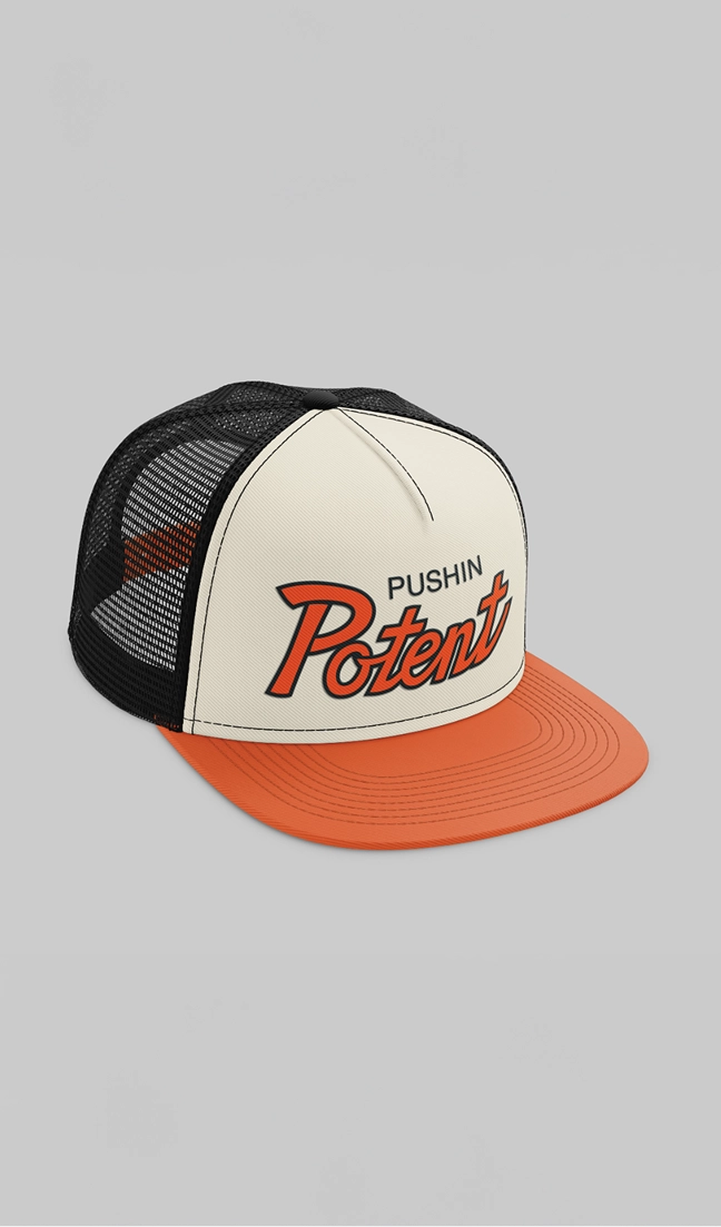
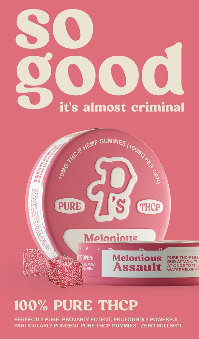
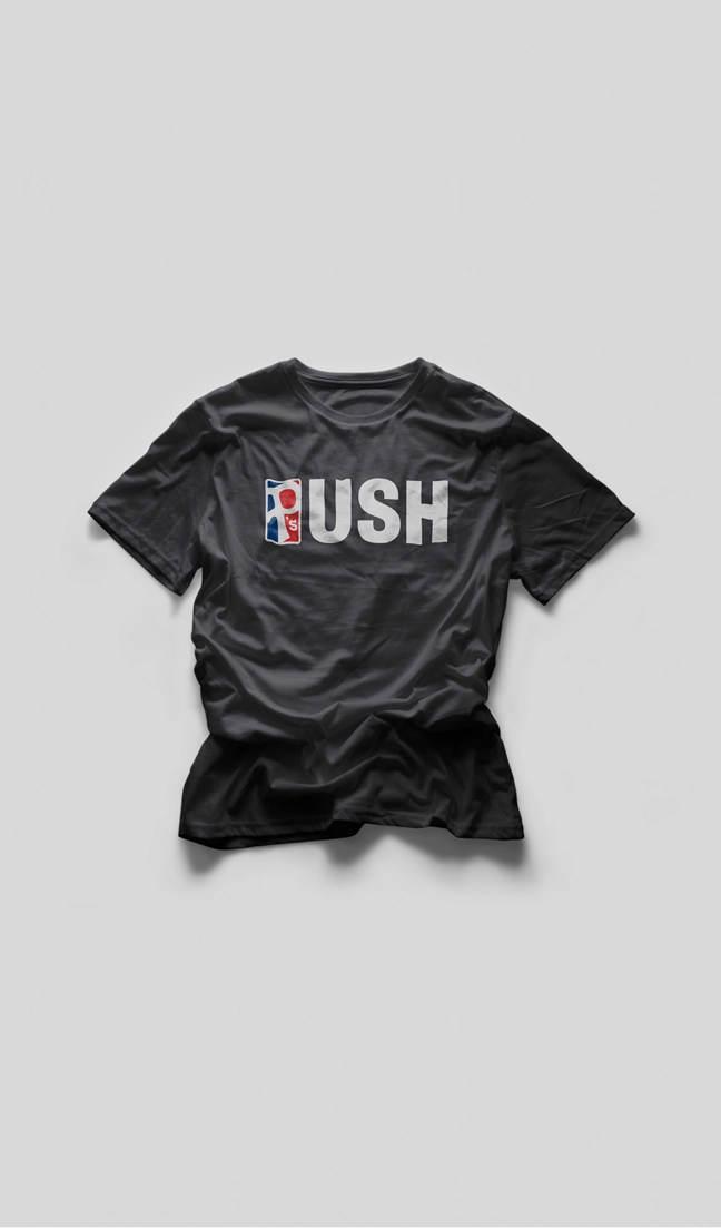
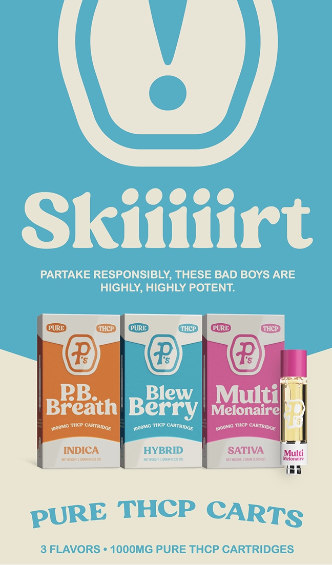
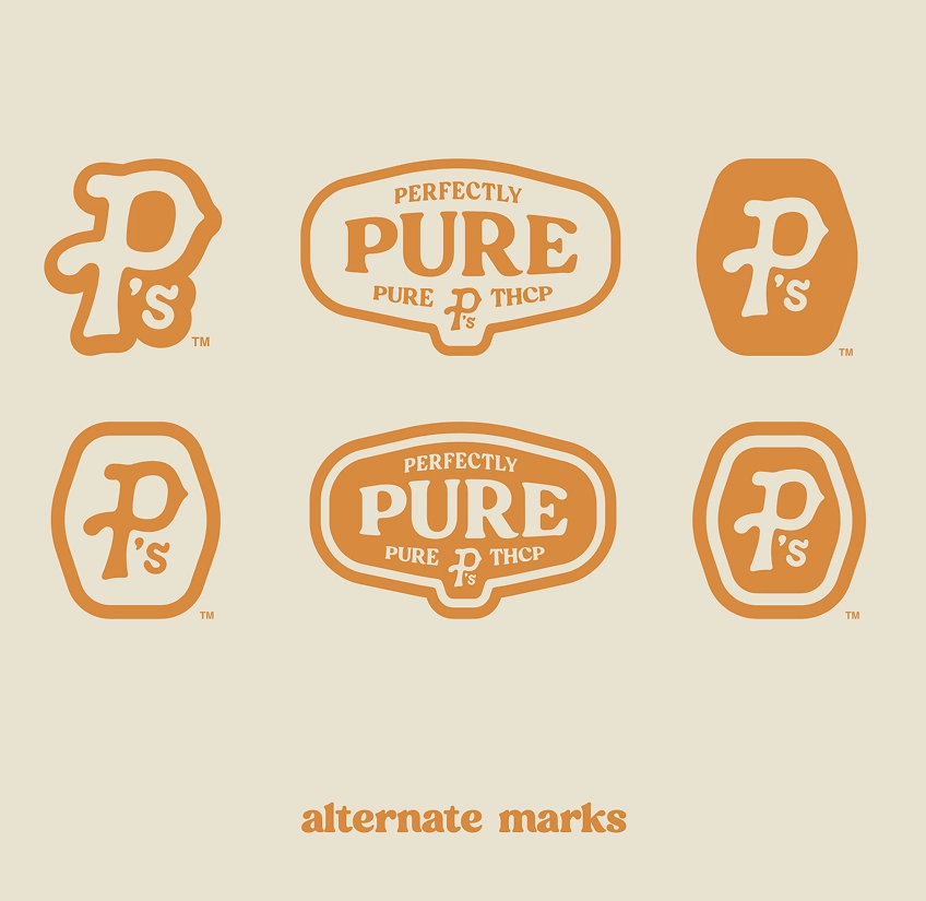
The hand-drawn logo adds warmth without softening the impact. Inspired by sports marks and food packaging, it signals quality and familiarity without leaning nostalgic or cute.
P's proves that you can be smart without sounding scripted, and bold without being loud. A modern cannabis brand with structure, character, and staying power.

Book a short scoping call and we'll map your priorities to the right engagement.