
Reese + Murphy treats pet products as part of the home, not something to hide when guests arrive. An interlocking monogram carries utility without losing elegance; patterns come from interior textiles rather than novelty pet clichés; packaging frames the product first.
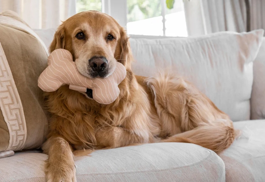
Reese + Murphy repositions pet products as part of the home, not something to hide. It's a brand shaped by restraint, intentional in every detail, from form to finish.
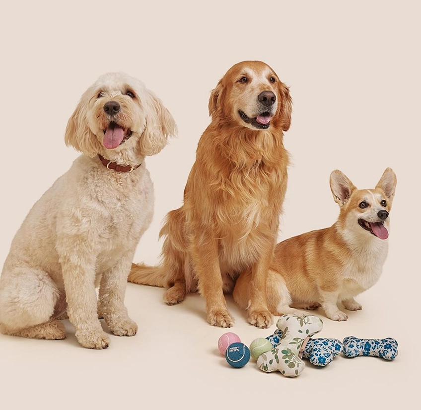
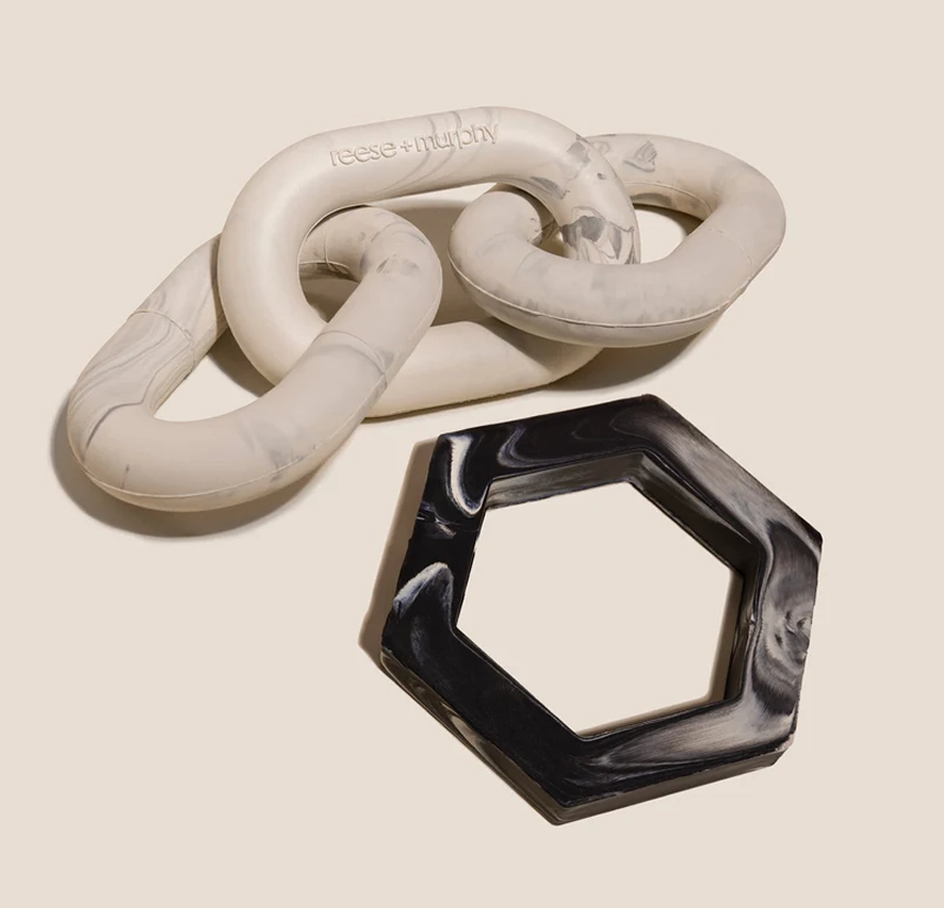
The identity starts with a monogram built for structure. Interlocking letterforms create a clean mark that signals utility without losing elegance. It's not decorative. It's foundational.
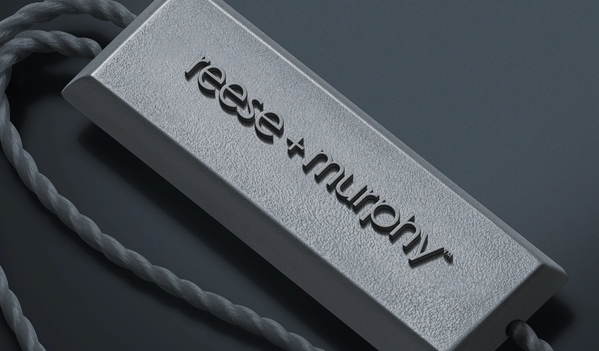
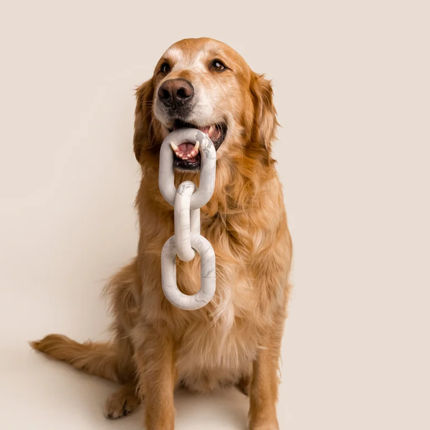
We kept the palette neutral. No neon. No gimmicks. The typography speaks with control—clean lines, quiet spacing, and just enough weight to carry authority without posture. Product patterns were pulled from interior textiles and translated into forms that feel considered, not novelty-driven. Designed for dogs, but built to hold up in design-conscious homes.
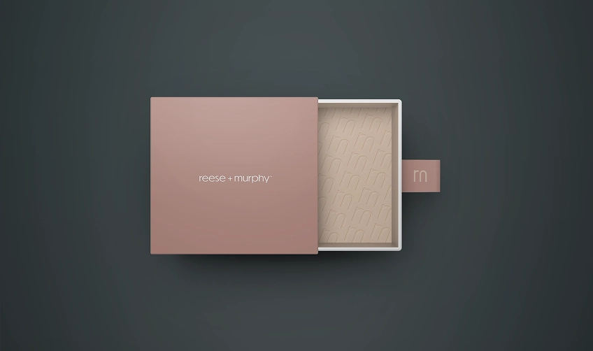
Packaging was reduced to what matters: structure, clarity, and brand recognition. No over-explaining. No storytelling on the box. Just clean framing that supports the product without crowding it.
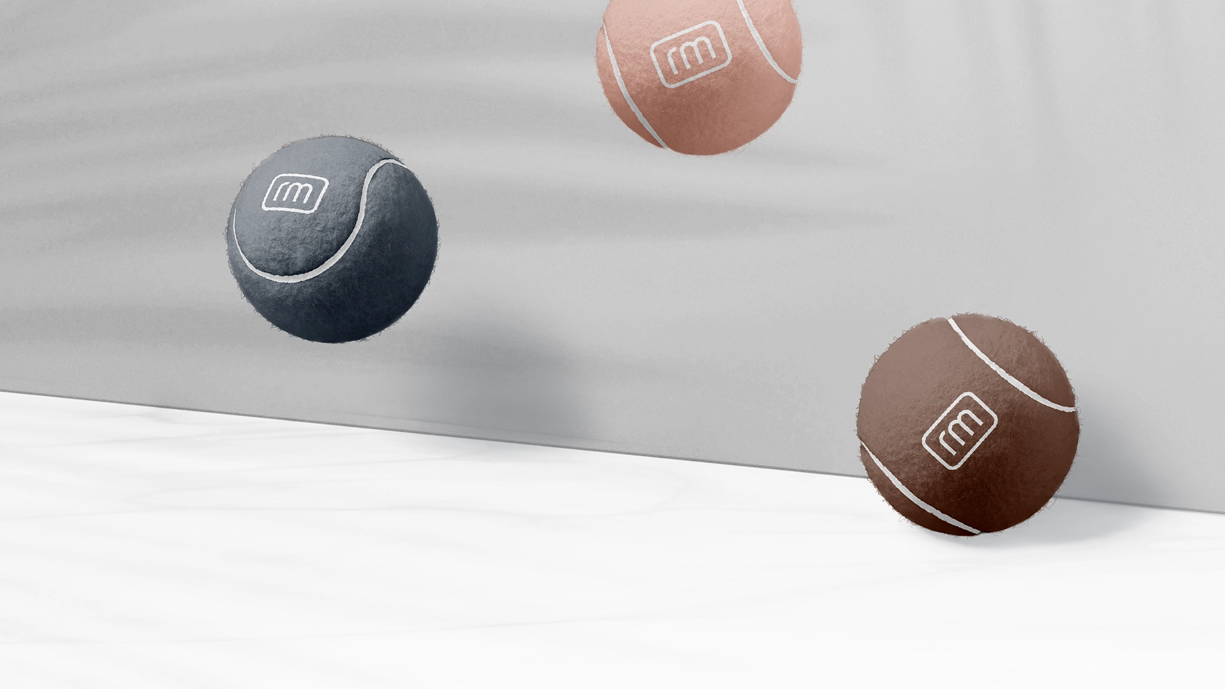
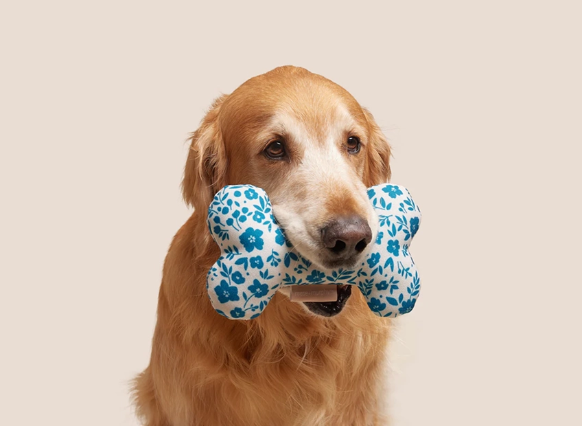
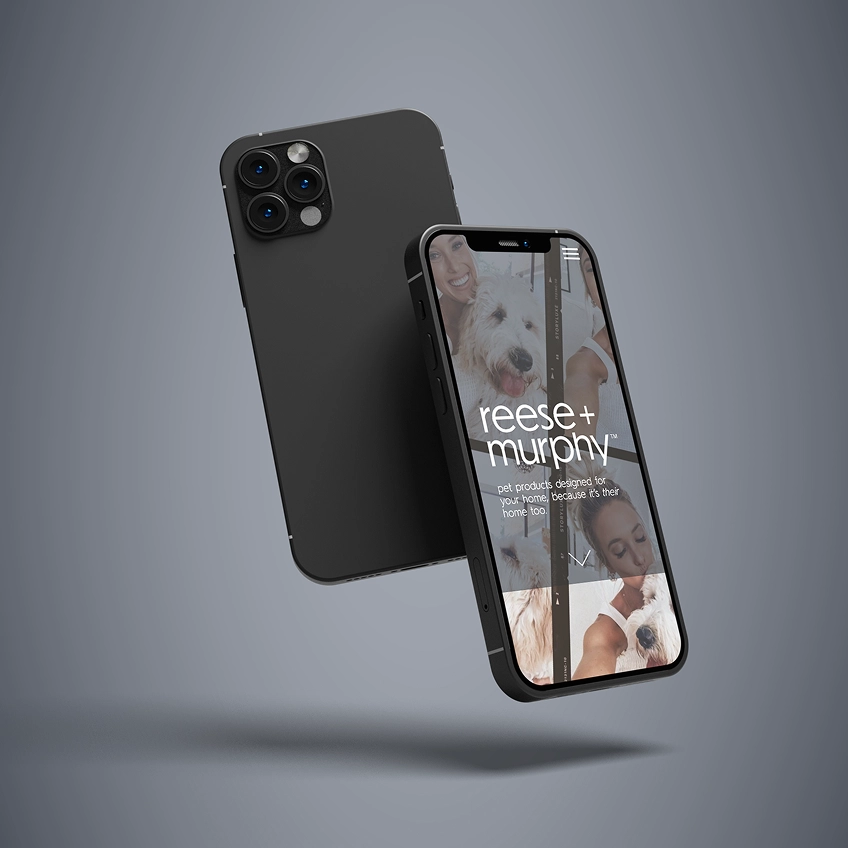
Reese + Murphy shows how minimal design, when done with discipline, can redefine a category. The result isn’t just a better-looking pet brand. It’s a brand that holds up anywhere it lands.
Book a short scoping call and we'll map your priorities to the right engagement.